| Note: This is a guest post by Will Hoekenga, founder of Copygrad.com. Be sure to read to the end for a killer bonus and giveaway. |
You ever suck at something but know you don’t have the skills to do it yourself?
I do.
That area was optimization. So, I set out to learn more about it.
Thats when I met Will Hoekenga. He writes at Copygrad and works for guys like Andy Andrews and Robert D. Smith. He helps them to optimize, produce and launch their courses.
Soon after I found out he was a local Nashvillian and we started chatting. One thing led to another and he offered to do a complete teardown of this site, our sales funnels, call to actions and email series.
I quickly obliged.
I’ve discovered that the best way to learn how to do something is to see someone else doing it. Hearing someone talk in theory and broad generalization is annoying.
I WANT SPECIFICS.
So, Will agreed to come here and spell out every step of the process.
In this guest post he is going to share:
- What we suck at
- How we can improve
- Thought process for each change
- Plan to measure the results
Enter Will…
* * *
When Bryan and I started talking, we quickly identified the three parts of Videofruit that he could most directly benefit from optimizing (a fancy word for making something get you more sales, email signups, or some other positive result). We landed on:
- The Videofruit.com home/landing page
- The Videofruit blog sidebar opt-in area
- The email autoresponder for Bryan’s excellent “How to Create Awesome Promo Videos” course
The grounds trembled, the sky parted, and thus—the Videofruit Optimization Experiment was born!
In this post, I’m going to lay out exactly what changes were made and why they were made, which will give you insight into how you can apply similar changes to your own copy.
Note: Some of these changes are still in the process of being implemented.
In 30-60 days, we will be revealing the results of all three tests.
DISCLAIMER: Ideally, all of the ideas listed below would be tested one at a time. Meaning, instead of testing several new elements on a landing page, for example, you would start by testing a new headline. Then you might test the call-to-action. Then you might test something else. And then something else.
However, when you’re not getting tsunami waves of traffic every day, you can’t always afford to wait and test every single little element. Sometimes, you have to make global changes and live with the fact that you might not be able to pinpoint exactly WHICH change was responsible for making the biggest difference.
Now that we have that out of the way, let’s dive in!
Part 1: Videofruit Homepage/Free Course Landing Page
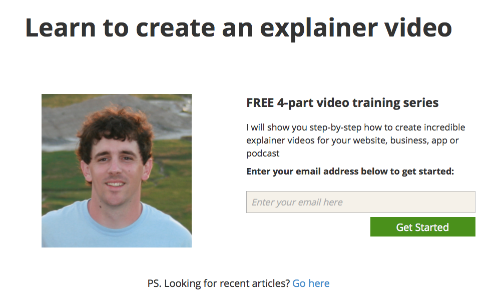
Here is a screenshot of the original page that appeared when you went to www.videofruit.com:
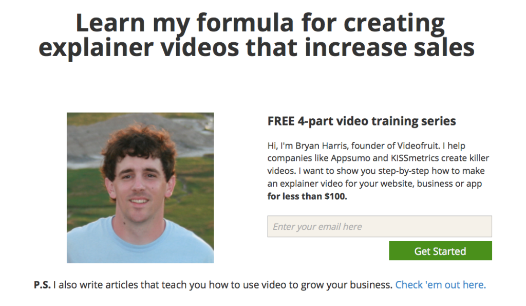
Here is the “B” version with my copy changes:
Let’s take a look at what changed and why.
Change #1: The Headline
The headline changed from “Learn to create an explainer video” to “Learn my formula for creating explainer videos that increase sales.”
The thought behind this change is pretty simple—not everyone is walking around thinking, Gee, I could really use an explainer video, but tons of people are thinking stuff like, Man, I really need to get my sales up, or, Why isn’t the video I have up helping my conversion rate?
This headline spells the benefit of going through the free course in plain English.
Another thing? That “increase sales” part is 100% BS-free. Bryan really was able to increase sales of an app he created by 300% using the material he teaches in the course. Remember: if you promise a result, be sure your product can actually deliver on it.
Change #2: The Body Copy
Three things were accomplished with the “B” version of the body copy:
- We put a name to Bryan’s face (“Hi, I’m Bryan Harris…”). His personality is all over Videofruit, and this change makes the page warmer and more personal.
- We provided social proof. Before, there was no indication that Bryan has a track record of impressive success and clients (which he does). With the simple addition of, “I help companies like Appsumo and KISSmetrics create killer videos,” authority/credibility is established.
- We killed the common “video is too expensive” objection with the addition of “for less than $100” at the end of the paragraph. This claim demands attention.
There are lots of places online that will teach you how to make a great video. This new body copy sets Bryan’s course apart by showing visitors why he is the guy they need to learn from.
Change #3: The P.S.
Let’s face it—not everyone who lands on this page is going to sign up. But that doesn’t mean we should give up on them.
Originally, the P.S. was a little vague: “Looking for recent articles? Click here.” Anyone who has read the Videofruit blog knows Bryan’s posts provide WAY too much value to simply be called “articles.”
That’s why we changed it to, “articles that teach you how to use video to grow your business.” It’s more specific and gives visitors an idea of what to expect.
Part 2: Videofruit Blog Sidebar Opt-In Area
If you look to the right of this post, you’ll see a sidebar opt-in area that looks something like this:

For this piece, I made three copy changes. Let’s take a look.
Change #1: The Headline
You’ll notice I like testing new headlines. 🙂
The headline is the first thing people will read most of the time, so it’s a big change anytime you test something different. And it’s the big changes that give you the best opportunity to influence your conversion rate dramatically.
Pro Tip: When testing things on your own site, always go for big changes in the beginning. You will learn a lot more from testing different headlines than you will from testing stuff like different button colors.
So this was the biggest change to the sidebar opt-in. Going from:
Free Course: “Bootstrapper’s Guide to Explainer Videos” + Extra Bonus (Valued at $250)
to
Free Course: How to Make One Simple Video That’ll Win You More Customers
Like the headline change on the homepage, this second headline speaks the visitor’s language by speaking to a clear need: “more customers.”
I also wanted to try toning down the “sales” factor, which is why “Extra Bonus (Valued at $250)” is gone.
In future tests, we could definitely try adding that back in depending on the results. Taking away “Free Course” is another idea that would be worth testing.
Change #2: The Body Copy
There were only two additions made to this copy. Since I took the “extra bonus” language out of the headline, I wanted to add it in here to clearly communicate the added value. That’s why you’ll find “There’s also an “extra bonus” you’ll find on the inside!” tacked onto the end.
This communicates the extra value while also providing a little suspense.
The other change was to simply kill another common fear many video newbies have: the pain of learning/paying for new software. That’s why I added “(without learning any software)” to the first sentence.
It’s always a good idea to look for opportunities to squash whatever objection is most likely to appear in your prospect’s mind. Most people are subconsciously looking for reasons to talk themselves out of things. Keep that in mind.
Change #3: The Button Copy
This is what I call a “conventional wisdom” test. I wanted to test button copy that lots of people seem to be using to make sure we weren’t overthinking this part of the sidebar.
So we changed “Yes, Let’s Start the FREE Course” to the simple, often used “Get Free Access.”
There’s also a subtle distinction here (that may or may not make any different, but it’s worth pointing out).
Version A identifies the course as a “FREE Course.” Version B, however, says you will get “Free Access.”
The difference is that Version A implies the course is always free, while Version B says you will be getting free “Access.” This implies some kind of special opportunity of privilege that might not always be available to everyone.
It’s subtle for sure, but it’s there nonetheless.
Part 3: 10-Part Email Autoresponder Series
This was the biggest element to test—a 10-part autoresponder email series that is triggered when someone opts in to receive Bryan’s free 4-part video course we’ve been talking about.
The emails are designed to get the recipient to click through and watch each of the four videos, the last video being a pitch to purchase an even more in-depth course called “How to Create Awesome Promo Videos.” After the fourth video, the remaining emails are designed to get the recipient to purchase enrollment in the course.
With an autoresponder series like this, there are many moving parts and pretty much an endless amount of variables that could be tested—subject lines, email copy, length of series, timing of emails, offer, scarcity, price point…and that’s just the tip of the iceberg.
So I wanted to focus on making a few big changes as opposed to testing every single thing under the sun.
Here’s what we came up with:
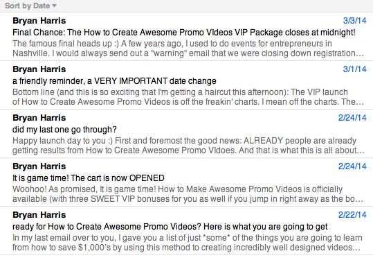
Change #1: Length
Originally, this autoresponder came in at a whopping 18 days. The timing was as follows:
- Day 1: Sign-Up Confirmation / Video #1 Delivery
- Day 2: “What are you fears?” email
- Day 3: Video #2 Delivery
- Day 5: Video #3 Delivery
- Day 7: Course Launch Tease #1
- Day 9: Course Launch Tease #2
- Day 11: Cart Open
- Day 12: Cart Open #2
- Day 16: Cart Closing Soon
- Day 18: Cart Closing Final Reminder
A general rule of thumb with autoresponders and sales sequences is the higher the price point, the more content you’ll need to send.
Given the price point of $397, I thought we could scale both the amount of emails and the length of the series back a bit. Here is what the timing looks like in the new version:
- Day 1: Sign-Up Confirmation / Video #1 Delivery
- Day 2: “What are you fears?” email
- Day 3: Video #2 Delivery
- Day 5: Video #3 Delivery
- Day 6: Cart Open #1
- Day 7: Cart Open #2
- Day 8 (AM): Cart Close Reminder
- Day 8 (PM): Cart Close Final Reminder
As you can see, there are now only eight emails instead of ten, and the series takes place over eight days instead of eighteen.
At first glance, it might seem a little pushy to send an email every day (and two on the final day) once the cart opens, but we’ll take a look at the thought process behind that as we go forward.
Change #2: Kill the Tease and Terminate the Objections
The ultimate goal of optimizing this email sequence is, of course, to get more sales. So I wanted to experiment with toning down the tease and getting to the sale quicker. I wanted to put the next level right in front of the prospect’s face after they’re done with the free stuff.
Doing so also allowed us to get rid of two emails and shave four days off the entire sequence (something I wanted to do).
It also got rid of a lot of good selling points (something I didn’t want to do).
The solution? I completely deleted the two “tease emails” and then totally rewrote the second “cart open” email to include tons of great selling points. I named the new version of the email “How to kill your 5 biggest video fears” (which became the subject line).
This email accomplishes the very important task of explaining to your prospects why this is the course for them.
Where did I get these “5 biggest video fears,” you ask? Bryan, being the hyper-intelligent human being he is, had included a brilliant email in his original sequence (which I kept in there) that came right out and asked the prospect what his or her biggest video fears are.
He shared a PDF with me containing over 20 actual responses he had received.
For the sake of not making this an even more gargantuan post, I won’t include the copy here. If you’d like to see it, snag the bonus download at the bottom of the post, The Videofruit Optimization Experiment: Complete Copy Files. It contains all of the copy and behind-the-scenes notes from this process.
Change #3: The Little (Big) Things
So often, all it takes is a second set of eyes to show you the mistakes that are right under your nose.
As I went through the emails, I noticed that the text displays really small. In fact, the text in the footer is actually a larger font size than the actual body copy. See for yourself:
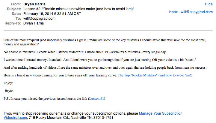
Making the font larger and more readable is a quick fix that will most certainly keep people reading longer.
What’s Next?
And there you have it—the Videofruit Optimization Experiment [insert maniacal, evil mad scientist laughter here].
In 30-60 days, you’ll see another post with Bryan and I going over exactly what worked, what didn’t work, and where we’ll go from there.
Until then, grab your copy of our complete copy files for the experiment. And let us know in the comments section—how do you think the results will shake out?