Most homepages are a handful of tweaks away from generating a dramatically higher number of email subscribers.
For example, Tera Wages recently 5x’d the number of new leads her homepage drives on a daily basis—all by applying a few simple changes anyone can duplicate.
In this post, I’m going to walk you through exactly what Tera did so you can apply the same framework to your own homepage.
Let’s dive in.
The #1 Goal of Your Homepage
First things first—unless you are an ecommerce company, the #1 goal of your homepage should be to generate new email subscribers (AKA leads).
If you sell consulting, coaching, or online courses, your homepage visitors are almost never going to be ready to purchase whatever you sell immediately.
And if you sell your product or service over the phone, they’re rarely going to want to book a call with you immediately.
Don’t jump straight to the highest-friction action you could possibly ask them to take.
Instead, keep it simple. Focus on solving ONE common problem for your best-fit customers. And present that solution in the form of a free resource they can receive in exchange for their email address (AKA a lead magnet).
Making this free resource the key focus of your homepage
Before and After: How Tera Took This Homepage from 6 to 30 New Leads Per Day
Let’s start with the original version.
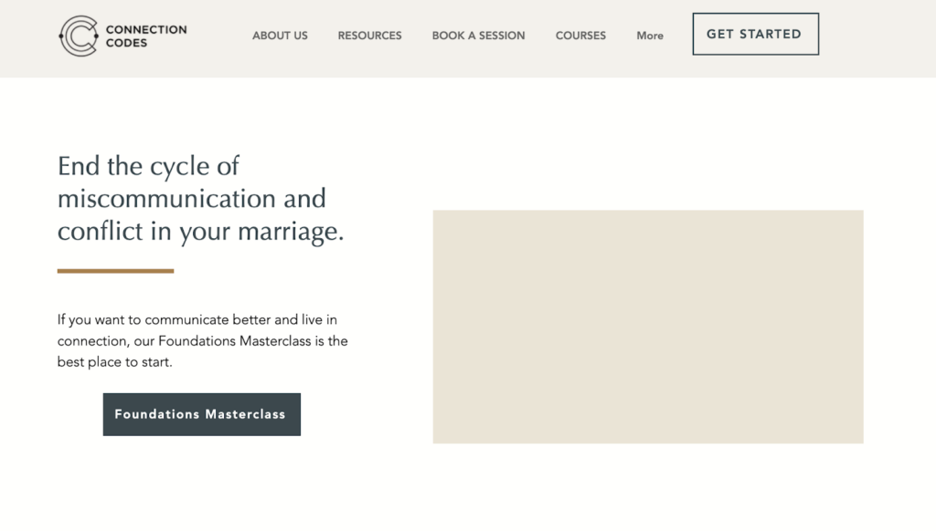
This was the previous above-the-fold section for Connection Codes, an online course business built by a marriage and family therapist:

(There’s a photo missing in that rectangular space on the right…but you get the picture.)
Remember what I said earlier? This is exactly what you should NOT do if you are an online course creator—lead with a CTA for your course.
Again, 99.9% of homepage visitors aren’t ready to buy from you yet. So instead of letting them bounce, capture their email address.
That way, you can warm them up with content and easily convert them when they’re ready to buy.
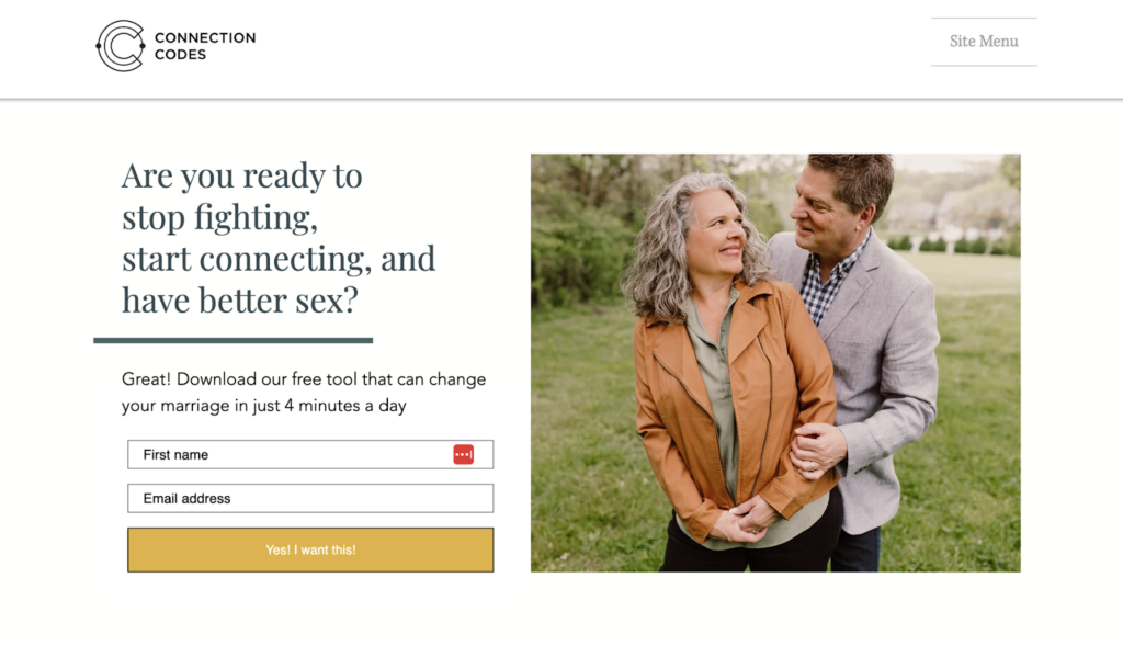
So…what’s the best way to get more email signups? Structure your above-the-fold section like the new version Tera made:

It’s easy to see why the page is now generating 5x as many email subscribers every day.
It only needed 3 ingredients:
- A clear, simple headline that focuses on a common problem.
- A free resource that solves the problem.
- An email opt-in form.
You’ll also notice that Tera collapsed all those distracting navigation bar links into one “Site Menu” button. Smart move! You want to minimize competition for your visitors’ attention.
Ready to apply Tera’s approach to your own site? Keep reading.
How to Create the Perfect Lead Magnet for Your Homepage
The perfect lead magnet for your homepage is the one you can create quickly.
Seriously.
Don’t spend weeks creating the world’s greatest PDF from scratch.
Instead, think about helpful content you’ve already created.
What are your most popular blog posts?
Which emails to your list have gotten the most opens and clicks?
Make a list of them all. Then identify the one that helps solve the most common problem your audience faces.
For example, let’s say you’re a dog trainer.
If one of your most popular blog posts is “5 Commands Every Puppy Should Learn First,” you can easily condense it into a downloadable PDF and offer it as a free guide.
To create your headline, simply tie in a painful problem the guide solves.
In this case, we can borrow Tera’s headline structure to quickly create several ideas:
Ready to stop cleaning up messes and have an obedient dog?
Ready to stop losing sleep to a disobedient dog?
Ready to stop begging your puppy to obey?
Then, simply present your free guide as the solution.
It’s really that simple.
Check Out Tera’s Case Study for the Full Story
I recently sat down with Tera to get the full scoop on her homepage optimization. Plus, she also filled me in on the Black Friday / Cyber Monday campaign that 10x’d her previous year’s course sales.
Click here to check it out now!