This article will show you how to create a successful high-ticket sales funnel.
Including:
- How to get qualified prospects to book sales calls
- How to create call booking pages that prime your prospects to buy
- How to create a sales script that converts prospects to customers
- And much more!
So, if you want to improve your high ticket sales funnel or create one for the first time, this is for you.
How do you sell expensive (AKA: high ticket) products or services online?
After spending the past 30 month running 100s of tests in an attempt to answer that question, my team and I have developed a system that allows us to profitably and sustainably sell online products or services priced between $5,000 and $50,000.
So far, we’ve generated $2,125,083 in sales from our high-ticket coaching program. We haven’t mastered it, but we’ve learned a ton along the way!
In this marketing makeover I’m going to teach you everything I’ve learned by rebuilding another company’s high-ticket sales funnel from scratch.
Meet GravySolutions.io.
Gravy helps subscription-based businesses recover failed payments from their customers.
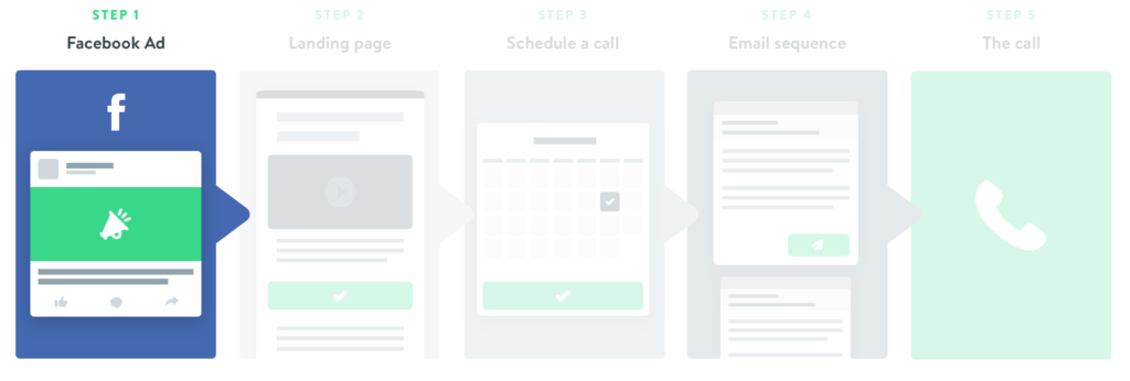
The structure of Gravy’s sales funnel is this:
- They show you an ad on Facebook.
- The ad takes you to a blog post and presents a CTA to book a sales call.
- After you book a call, they send you a few emails to remind you to show up.
- On the call, they tell you about the service and ask you to become a customer
 Get it Free Featured Download: Get our entire high-ticket sales funnel. Including email sequence templates, landing pages and sales call script.
Yet based on what I’ve learned from the process of building our own profitable high-ticket sales funnel—and helping dozens of our coaching clients do the same—I believe there are 5 tweaks Gravy can make that will add additional $1+ million of sales to their business.
Recently we applied just one of these strategies to a client’s funnel, and it generated $94,000 in profit in the first 4 months.
I’ll break down Gravy’s funnel in detail, grade it against my process, and then show you I would optimize each part to increase sales.
In fact, I’ve rebuilt their entire funnel from the ground up—from landing pages, to video scripts, to email sequences, and more—so you can have examples and templates to use for your own high-ticket sales funnel.
This is the nerdiest, geekiest, in the weeds article you’ll read this year. 🤓
Tap into your inner marketing geek and let’s get started…
Funnel Stage #1: The Facebook Ad
TL;DR: The ad they are currently running has 5 problems keeping it from performing well. We’ve re-written and re-designed the ad to solve those problems. See the original ad and the new one we created.
To kick things off, let’s start with the entry point of Gravy’s funnel—the Facebook ad.
I’ve found there are 4 main things a Facebook ad for a high-ticket product must do to be effective:
- Highlight the specific problem that your service solves
- Agitate that problem by sharing what failure looks like
- Offer a downloadable asset as a solution
- Have a compelling visual that get’s people to stop scrolling
Take a look at Gravy’s existing ad.
How many of those 4 things do you think it accomplishes?
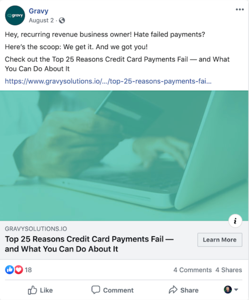
The current ad that they are using only meets 1 of the 4 criteria.
There are 5 major problems with this ad.
Problem #1: It has “bare minimum” copy.
Meaning it identifies the problem that Gravy’s service solves in the most basic way possible: “Hate failed payments?”
Problem #2: It assumes a higher level of problem awareness than it should
I know many people who have recurring or payment plan-based businesses. I have never heard one of them complain, talk about, or even be highly aware of what their failed payments numbers are. This ad leads with a pain that most of their target customers don’t know they have.
Problem #3: Poor customer targeting.
The ad identifies the type of customer it’s targeting with broad language: “Hey, recurring revenue business owner!”.
I’m pretty sure if you polled 1,000 people who own businesses with a recurring revenue model, literally 0% would say, “I’m a recurring revenue business owner.”
Problem #4: Oversimplification of the solution.
The ad implies there’s a solution to the problem without really giving any specifics on what the solution looks like: “Check out the Top 25 Reasons Credit Card Payments Fail – And What You Can Do About it.”
Problem #5: The ad image blends in.
The ad image is basically Facebook camouflage. It’s just not going to stand out when someone is scrolling through their newsfeed.
So, how do we fix these problems? What SHOULD their ad look like?
Here is the ad we created that solves these problems:
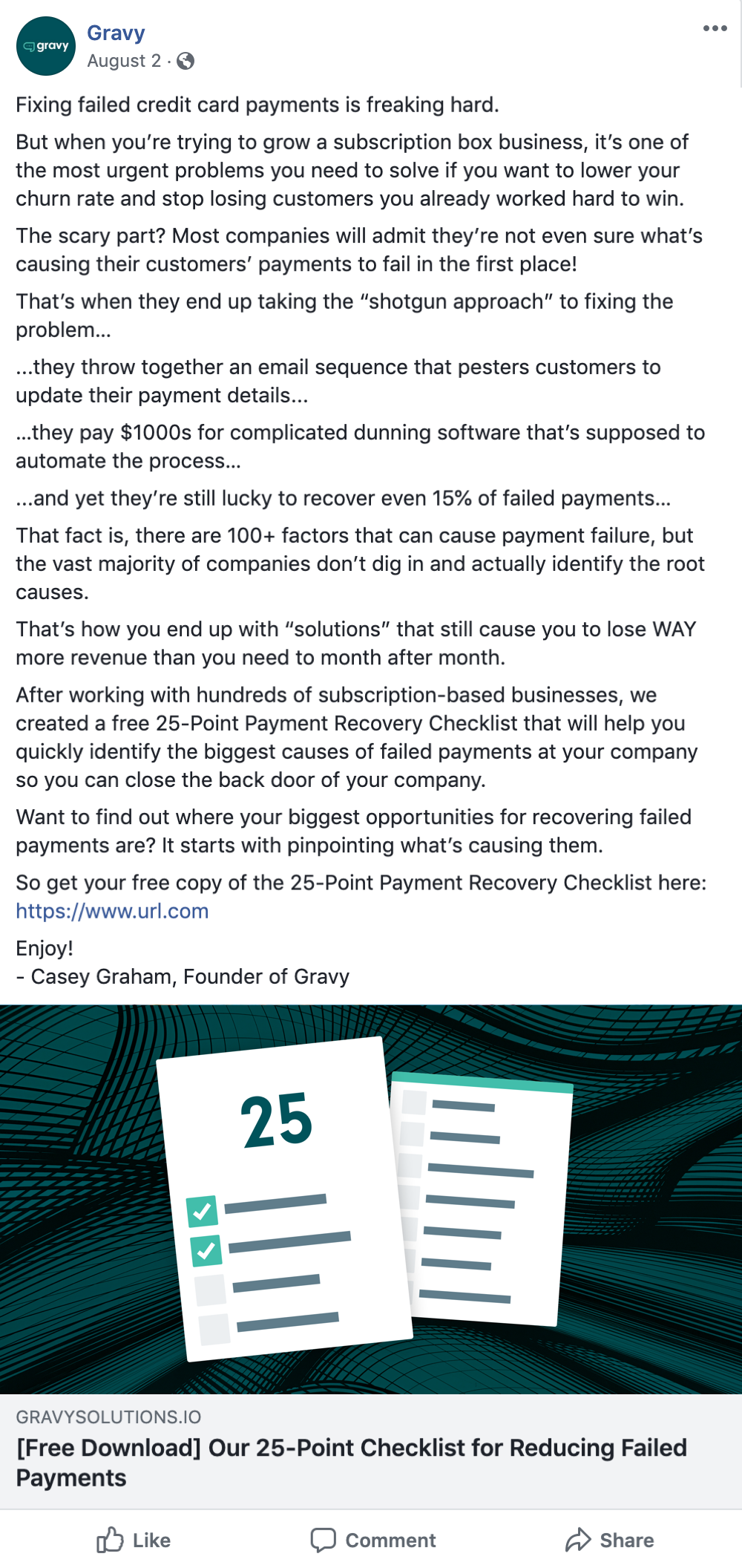
As you can see, we made some big changes.
Change #1: Narrowed the copy to focus on a specific type of customer
Instead of targeting ‘recurring revenue business owners.” we targeted people working for a specific type of recurring revenue business—subscription box companies (think Blue Apron, Barkbox, etc.)
Gravy could easily tweak this copy to cater to all their customer types and run more personalized ads to each type of customer.
Change #2: Got specific with the problem and agitated common pain points
We described their problem in detail, established the cost of NOT solving the problem, and touched on several of the solutions they’ve already likely tried.
Change #3: Crunchified the CTA
The call-to-action (CTA) is now centered around a tangible asset (Payment Recovery Checklist) that promises a specific outcome (help you identify your biggest causes of failed payments).
Change #4: Gave the ad image a makeover
Which ad image do you think is more likely to stand out? Ours or the original?
Next up, we’ll take a look at the landing page Gravy is sending people to after they click on the ad—and the all-new “2-part” landing page we created to replace it.
Funnel Stage #2: The Landing Page

TL;DR: The landing page prospects see after clicking on Gravy’s Facebook Ad isn’t ideal. It has 4 problems and is missing a core concept that could 2x sales calls. We’ve rebuilt the page to solve those problems. See the original landing page and the new 2-part landing page we created (part 1 & part 2).
After a prospect clicks the Facebook ad they come to Gravy’s landing page.
There are 2 primary jobs that the landing page needs to do well in order to get that prospect to advance in their funnel.
- Deliver on the ad’s promise (aka: give them the resource mentioned in the ad)
- Present a clear and compelling call-to-action to schedule a sales call
Take a look at Gravy’s existing landing page.
Does it do these 2 jobs?

The current landing page only accomplishes 1 of its 2 jobs.
It does a decent job of delivering the original promise of the Facebook ad. But things start to go wrong when we get to the CTA at the end of the page.
Problem #1: There are 3 different call-to-actions
Asking someone to do 3 things is the equivalent of asking them to do nothing. At the end of this article it 1) asks them to check out another blog post, 2) asks them to check out a case study, and 3) tells them to book a sales call (which is what Gravy actually wants them to do).
Problem #2: They don’t use a 2-step call booking process
By asking visitors to book a call on this page they are missing out on 100s of qualified leads. Why? Because there are thousands of people who come to this page, are kinda interested in learning more, but need a little more nurturing before they’re ready to jump on a call with someone.
Unfortunately, Gravy won’t have any way of following up with them once they leave.
That’s why we offer a lead magnet on our landing page and THEN offer a discovery call as a bonus on the thank you page once we have their contact information.
This allows you to continue to nurture leads via follow-up emails if they are not ready to book a call immediately.
Fun Fact: In our high-ticket funnel, half of our sales come from people who book a phone call through a follow-up email instead of booking it right after they click through the ad.
So, how do we fix this? What SHOULD their landing page look like?
Here is the 2-part landing page we created that solves these problems:
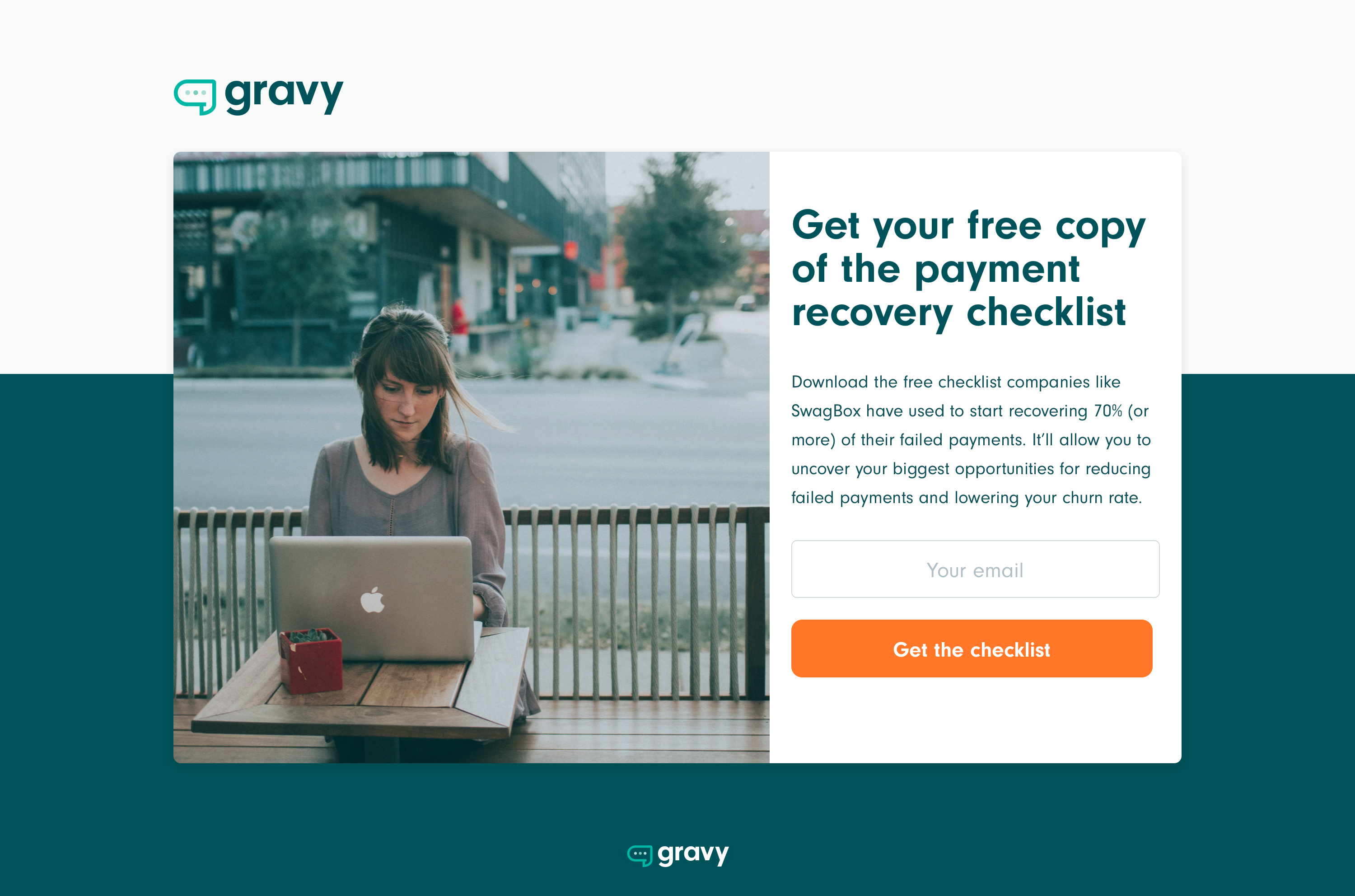
As you can see, we made some big changes.
Change #1: The landing page isn’t a blog post—it’s now an opt-in page
First, we replaced the blog post Gravy is sending people to with a landing page offering a downloadable lead magnet.
Change #2: It’s a lot shorter than the previous page
As you can see, this landing page is short, simple, and makes the next step we want the prospect to take as clear as day. It also immediately delivers on the promise of the ad we wrote.
By getting our primary CTA as far up the page as possible, the conversion rate will go up significantly.
Change #3: We went to a 2-step call booking process
This page also perfectly sets up the main thing we want people to do: book a discovery call (AKA a sales call). It does this by first collecting their contact information in exchange for the free resource, and then offering them the discovery call on the thank you page afterward.
This is what that “book a call” page (AKA the thank you page) looks like:
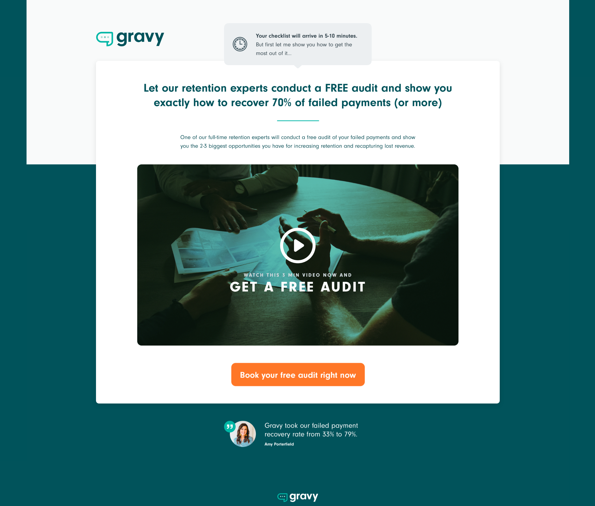
Remember, this is the page people will be sent to AFTER they enter their contact info on the previous page.
A few things that are important to highlight on this page:
Highlight #1: Sales calls will DOUBLE with this new 2-part landing page
By collecting their contact information first, we’ll now be able to follow up with anyone who doesn’t book a call on this thank you page. (More on that in a minute.)
Highlight #2: We completely reframe the phone call
Remember how Gravy described the phone call in their blog post?
“Be proactive and book a chat with Gravy today to find out how we can help you keep more of your subscription payments and customers, so you can continue to do what you love to do.”
Compare that to how we’re describing it on the thank you page:
“Let our retention experts conduct a FREE audit and show you exactly how to recover 70% of failed payments (and more)”
This reframes the call and makes it more enticing by focusing on the actual result they’ll get from the call.
Highlight #3: It’s a direct value-add to the lead magnet they just signed up for
If they opted in for the Payment Recovery Checklist, it logically follows that they might also be interested in having an expert audit their failed payments. The video on this page also mentions why doing the audit makes sense in addition to doing it yourself. (We even wrote a script for it! You can check it out right here and adapt it for your own video.)
Highlight #4: The video on the call booking page adds a personal touch
If you’re going to go from browsing your Facebook feed to booking a phone call with someone you’ve never met, it can be helpful to actually see their face and hear them talking to you. The video gives Gravy the opportunity to do exactly that.
But Wait…What Happens If Someone Signs Up for the Lead Magnet and Does NOT Book a Call on the Thank You Page?
Remember earlier when I mentioned that HALF of our sales come from people who don’t book a call on the thank you page?
That’s because they still ended up booking a call thanks to the follow-up email sequence we send them after they opt in for the lead magnet.
That’s why it’s SO critical to offer a lead magnet before you ask prospects to book a call. It allows you to continue to build a relationship with them and communicate the value of the discovery call.
And guess what? We went ahead and wrote out an entire follow-up sequence for Gravy so you can see exactly what it looks like and how it works.
Rather than walk you through each email here, we loaded the sequence into our free email sequence tool, Drip Scripts, so you can use it as a template for your own:
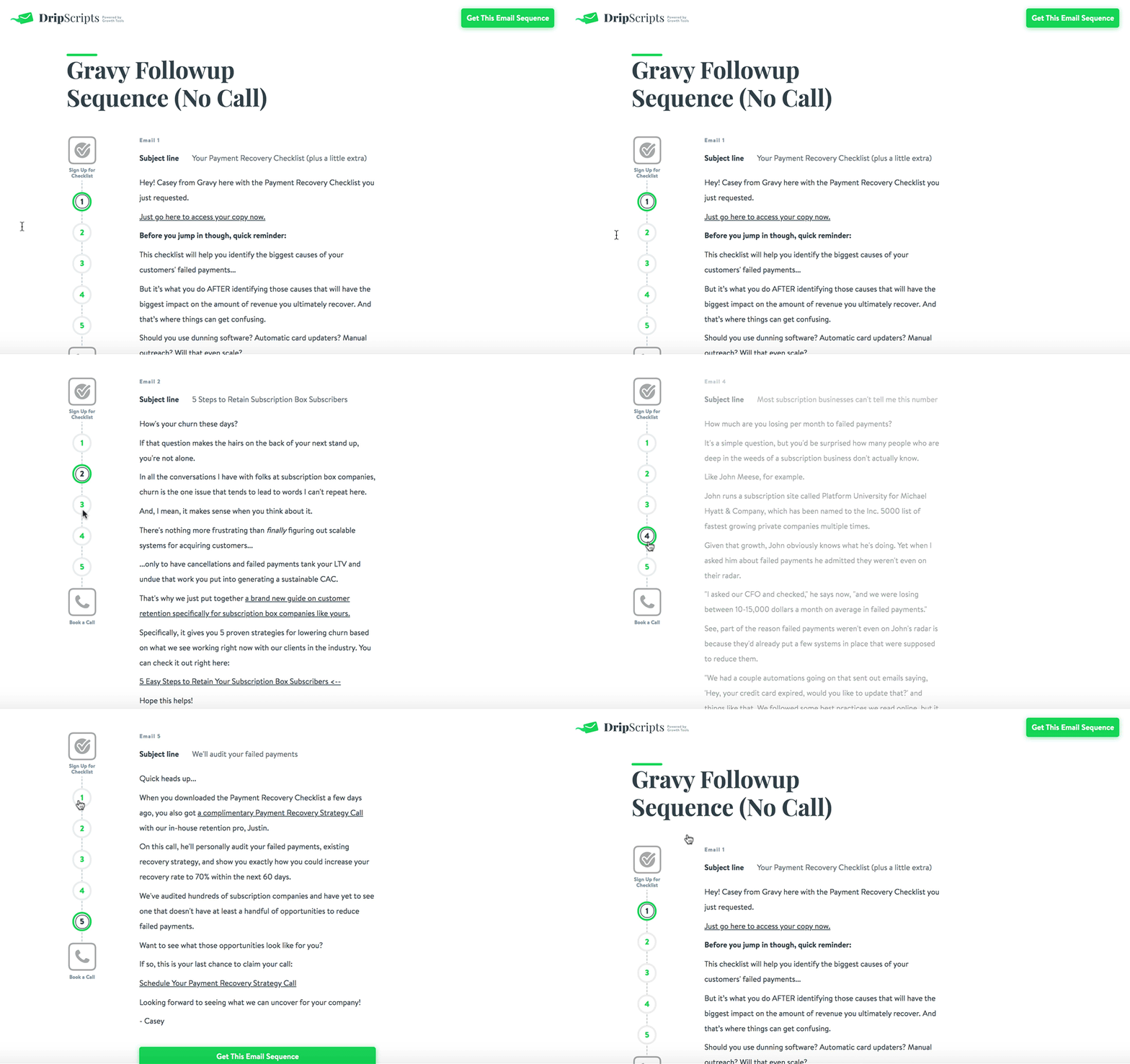
Click here to see this email sequence now.
For now, let’s go ahead and check out the next stage in Gravy’s funnel, which comes immediately after the CTA at the end of their blog post—the booking process.
Funnel Stage #3: The Booking Process

TL;DR: Gravy’s booking form is fine, but the confirmation page leaves a lot to be desired. It fails to do 3 things that will dramatically increase their show-up rate on calls. We built a new version of the page that takes advantage of those opportunities. See the original confirmation page and the new confirmation page we created.
Regardless of where the booking process starts in the funnel, our criteria for making it effective are simple.
There are 4 things you should be sure to do:
- Keep the booking form short and sweet
- Prime them for the call w/ the confirmation page
- Set expectations for the call
- Offer a value-driven assessment that includes additional qualifying questions
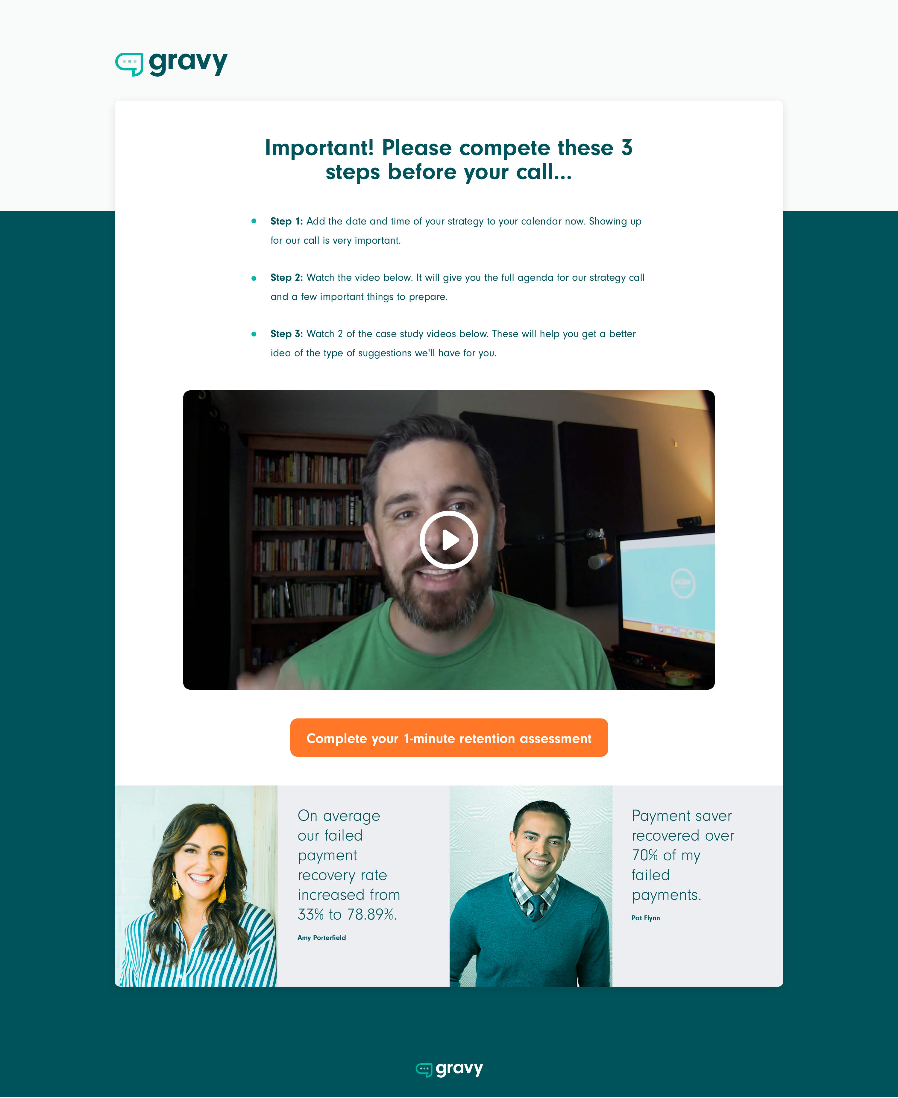
Check out Gravy’s original booking form and confirmation page and see how many of our criteria you think they meet:
Booking Form:
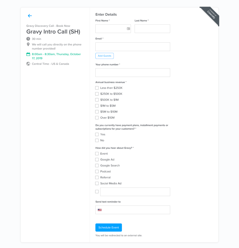
Confirmation Page:
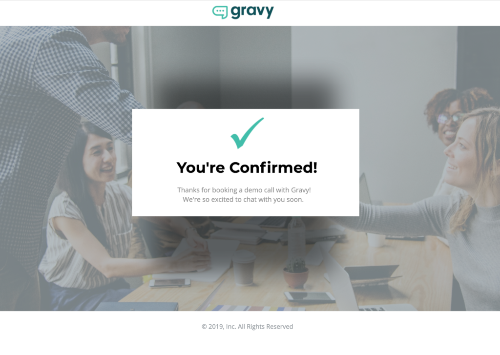
The current booking process only accomplishes 1 of its 4 jobs.
While they did a great job keeping the booking form short and sweet so prospects can quickly fill it out, their confirmation page does nothing to prime prospects for the value they’ll get from the call, set expectations, and take advantage of the opportunity to collect more qualifying info.
So, how do we fix this? What SHOULD their booking process look like?
Here is the new confirmation page we created that solves all of these problems:
There are 3 major differences between our page and the original version:
Change #1: It gives them additional steps to take that will increase show-up rate
They may seem small, but just by telling people to set a calendar reminder for themselves you will increase the number who actually pick up when you call them.
Change #2: We made a whole freakin’ video to sell them on the call’s value!
If you check out the script we wrote for the video, you’ll see that it fulfills our key criteria around priming people for the call and setting their expectations. Remember: just because someone signed up to get on the phone with you doesn’t mean the deal is done. SHOW them what they’re going to get out of it.
Again, you can read (and copy) our tested call confirmation video script here.
Change #3: We added a “1-Minute Retention Assessment” button underneath the video
What the heck is that, right?
Remember—since we kept the booking form short and sweet, there are still several more questions Gravy would ideally ask prospects before they get on the phone with them.
But instead of asking them to fill out something boring-sounding like a “Pre-Call Questionnaire,” we’ve created a value-driven hook for the questions: a 1-Minute Retention Assessment.
Here’s how it’s described in the video script:
“This is what we’ll use on our call to uncover your blind spots and surface your best opportunities and strategies for recovering failed payments. It’ll also give YOU a ballpark idea of the amount of revenue you’ll be able to recover with the strategies we’ll show you on the call.”
Positioning these questions like this totally flips the script on their perceived value. It’s no longer all about why WE need more information from you; it’s also about what YOU will get out of the questions.
The best part? Putting together this kind of assessment is super simple with a tool like Typeform. Here’s what Gravy’s 1-Minute Retention Assessment could look like…
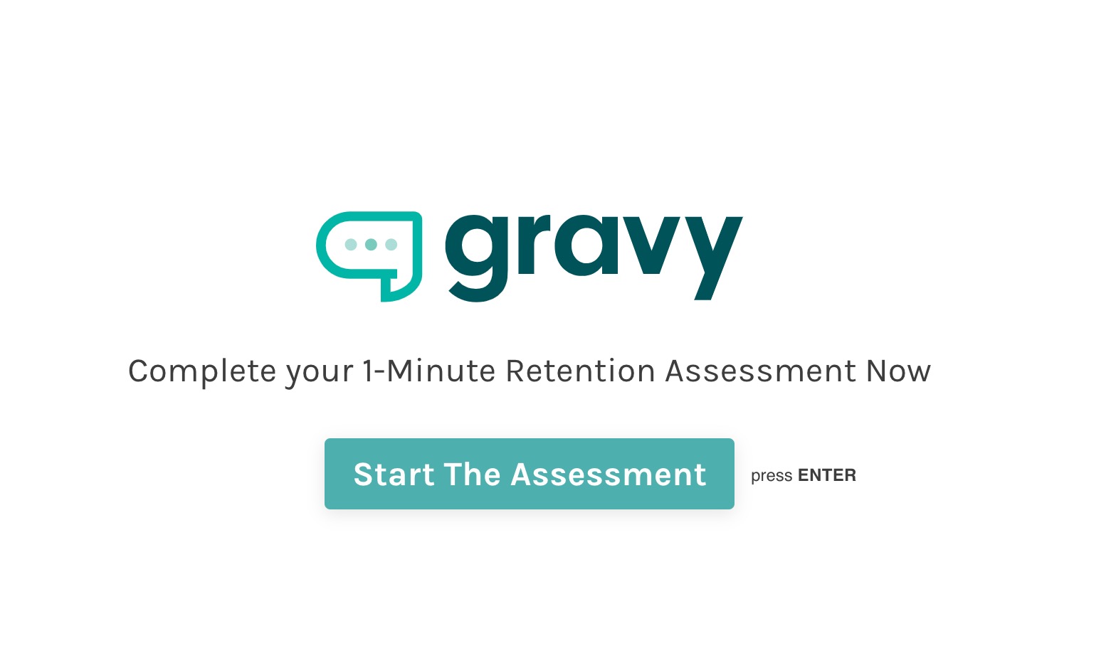
The assessment asks a series of questions that allow it to calculate an estimation of the failed payment revenue Gravy can help the prospect recover:
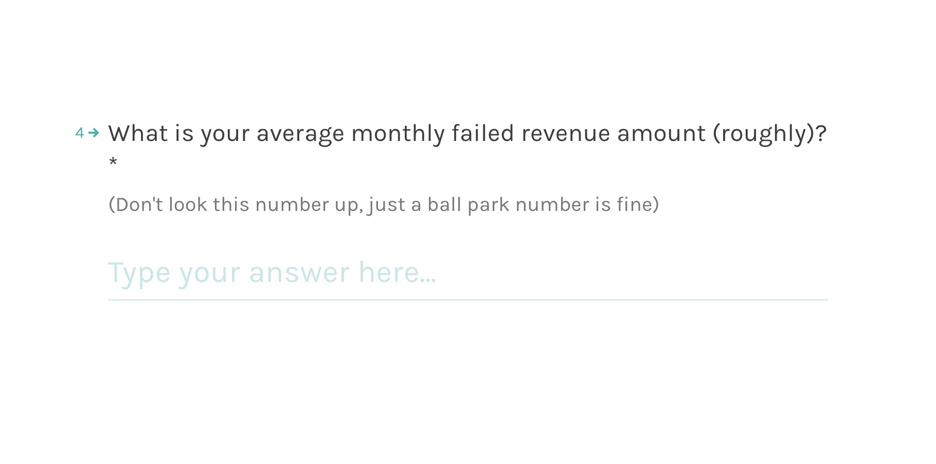
At the end, the assessment presents that number and reminds the prospect they’ll learn how to achieve it during the call:

Not only does the assessment increase the perceived value of the call, it also allows you to collect additional information about your prospects while they’re still engaged and likely to take action.
If you wait until the follow-up process to ask for this info, you’re less likely to capture it. Which brings us to the next stage of Gravy’s funnel…
Funnel Stage #4: The Show-Up Sequence

TL;DR: Gravy’s original Show-Up Sequence doesn’t meet two of our rules for maximizing show-up rate on calls. So we wrote a new sequence from scratch and loaded it into our free tool Drip Scripts so you can use it as an editable template for your own sequence.
Booking calls is great. But it’s ultimately meaningless if the people who booked them don’t actually show up.
Enter the Show-Up Sequence—an automated series of emails designed to…you know…get people to show up.
But if you really want to achieve a high show-up rate, you can’t just shoot out a few quick reminders and call it a day. The ideal Show-Up Sequence goes a level deeper by doing 3 specific things:
- Reinforce the agenda
- Remind them to complete the assessment (and explain what’s in it for them)
- Increase desire for the call with social proof
Let’s take a look at the 3 emails in Gravy’s Show-Up Sequence at a high level and see how many of those requirements it meets.
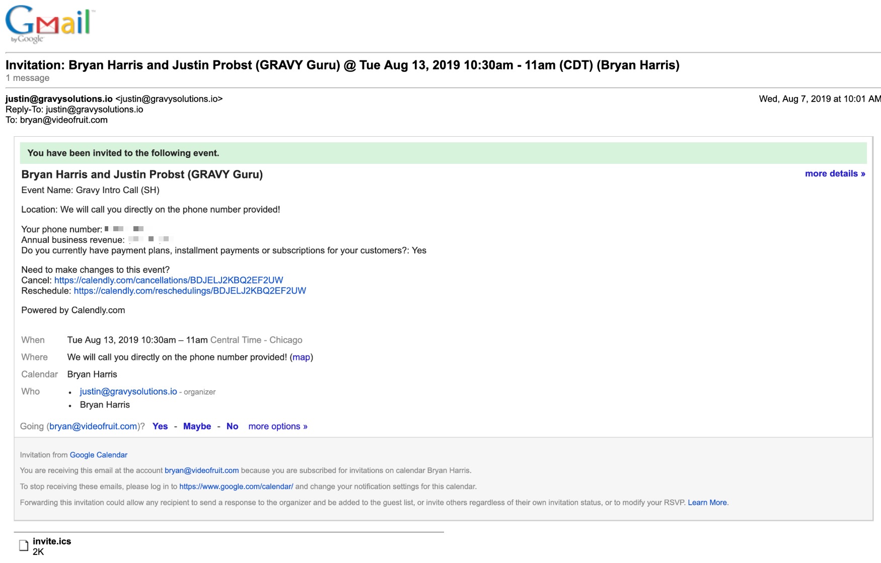
Gravy’s show-up sequence starts with a basic automated calendar invite email.
While it succeeds in providing the bare essentials, it fails to reinforce the value of the call and its agenda. Those details should be baked into the calendar event so that prospects are reminded of what’s in it for them when they see it on their calendar.
Email #2: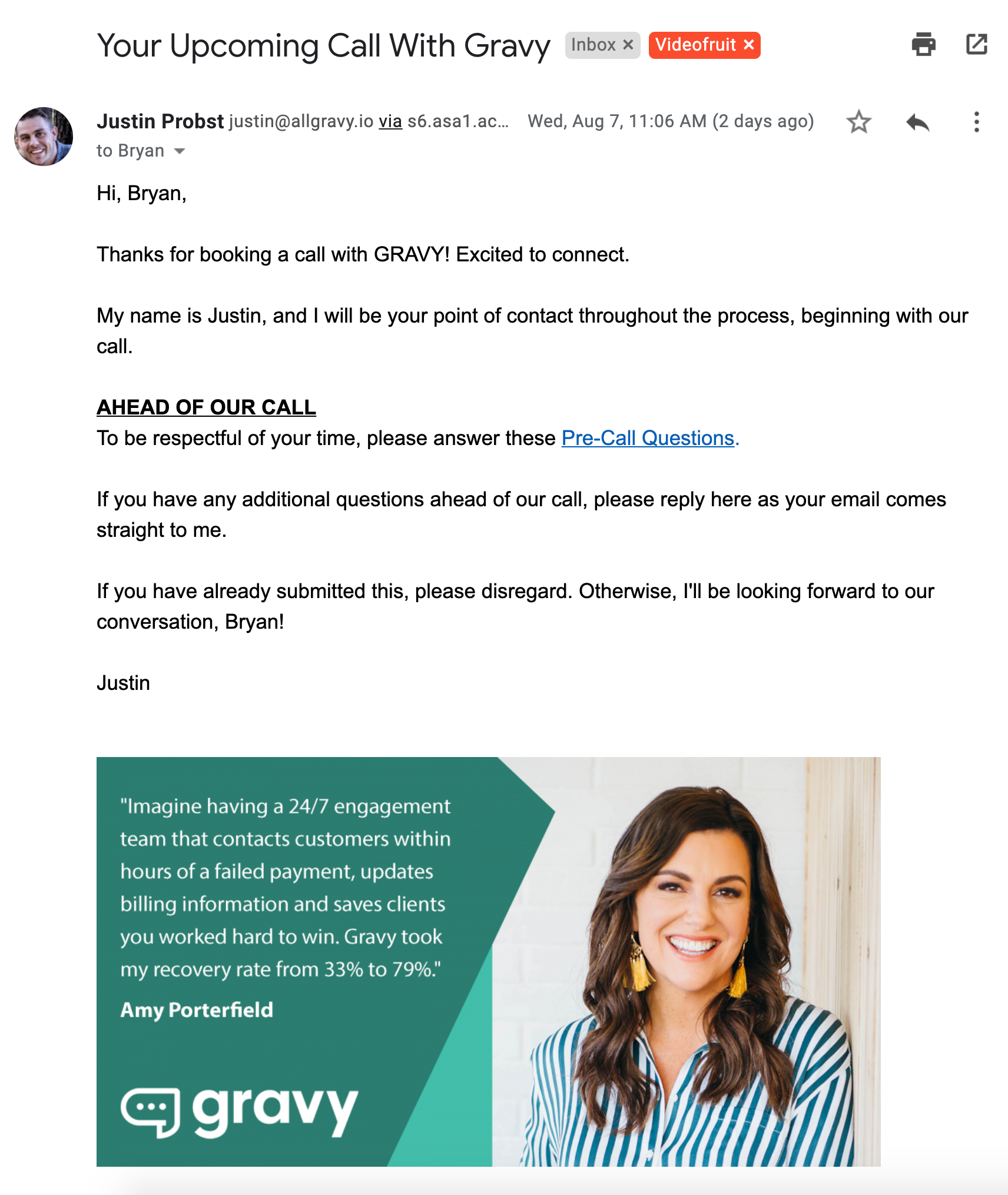
This is a personal confirmation email that comes directly from the person you’ll be speaking to during your call — nice touch!
Most importantly, it includes a link to a questionnaire that allows Gravy to collect some important qualification info ahead of the call.
Unfortunately, they’re not positioning the questions in any kind of value-driven way.
Unlike our booking confirmation page, which positioned the questions as a 1-Minute Retention Assessment, they just refer to them as “Pre-Call Questions” and give a vague reason for why you should answer them (“to be respectful of your time”).
Which would you be more likely to fill out: Pre-Call Questions or a 1-Minute Retention Assessment?
The testimonial/photo at the end of the email is nice social proof, but it seems like an afterthought and makes the email feel less personal.
Email #3: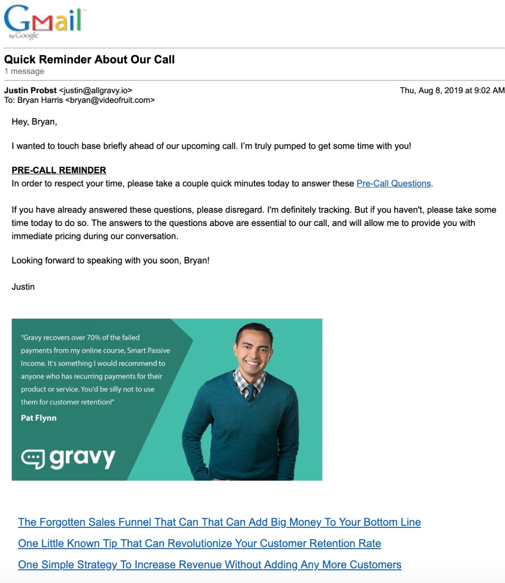
This email basically reiterates everything from Email 2, but also throws in another reason for the Pre-Call Questions:
“The answers to the above questions are essential to our call, and will allow me to provide you with immediate pricing during our conversation.”
Easy, tiger!
It’s always good to be 100% transparent that there will be some discussion of your product/service on the call, but you don’t have to do it in a way that screams, “I AM GOING TO SELL TO YOU!”
If I’m being generous, the current Show-Up Sequence accomplishes 1.5 of its 3 jobs.
It tacks on some social proof and reminds people to answer the additional questions, but it doesn’t really explain what’s in it for them if they do.
So, how do we fix this? What SHOULD their Show-Up Sequence look like?
I scripted out an entire new Show-Up Sequence for Gravy using our free email sequence tool, Drip Scripts, so you can use it as an editable template.
Instead of breaking down the new sequence email by email, I want to quickly highlight the key parts that make it fulfill our criteria for an effective Show-Up Sequence.
Highlight #1: We got the most out of the calendar invite email
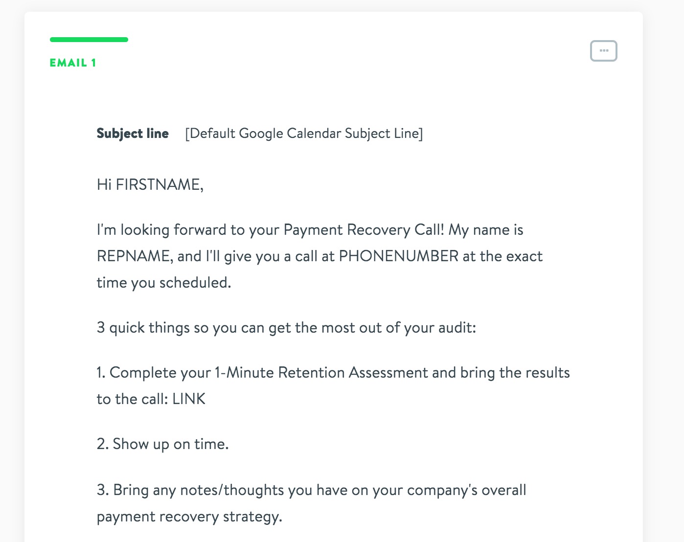
Instead of just including the default details in the calendar invite email that Google Calendar automatically sends, we add in the same type of details we would include if we were sending it ourselves.
That way, anytime a prospect looks at the event on their calendar, they’ll have the call agenda and the link to complete their Retention Assessment right there as constant reminders.
Highlight #2: We spin out testimonials/case studies into their own email
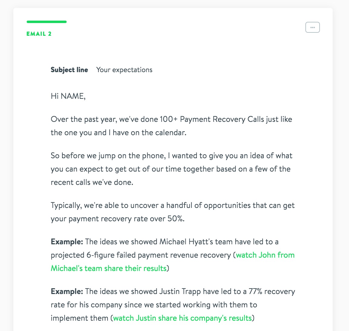
If multiple days pass between a booking and the actual call taking place, it’s always a good idea to stay in touch. But there are only so many ways to say, “Hey, just a reminder that we’re excited about your upcoming call,” without annoying the crap out of people. 🙂
That’s why we aim to send out value-driven reminders to prospects—emails that keep the call on their radar, but also give them something interesting or helpful that primes them for the call.
This case study email is designed to do just that. Instead of just saying, “Here’s a great result we got someone,” the case studies also give them an idea of actual strategies they could use.
Each link goes to a video of the customer sharing the strategies Gravy helped them implement:
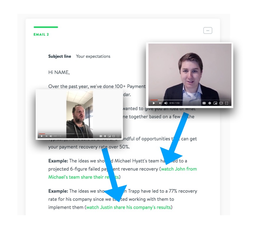
If you don’t have these types of videos from customers, they’re not hard to get! It’s as simple as asking them to record a video on their phone describing a result they got thanks to your services and the strategy/process that allowed them to get it.
Highlight #3: We repurpose emails into SMS reminders
Since the last two emails in our sequence are super straightforward reminders, I thought it’d be more helpful to highlight something we recommend beyond just the sequence itself—SMS reminders.
I don’t care how high your show-up rate is…it’s not as high as it could be if you’re not sending SMS reminders. That’s how effective they are.
They would also be super easy to implement since Gravy is already capturing phone numbers on their booking form. We use a service called EZ Texting to send out a confirmation SMS after booking and a reminder one hour before the call:
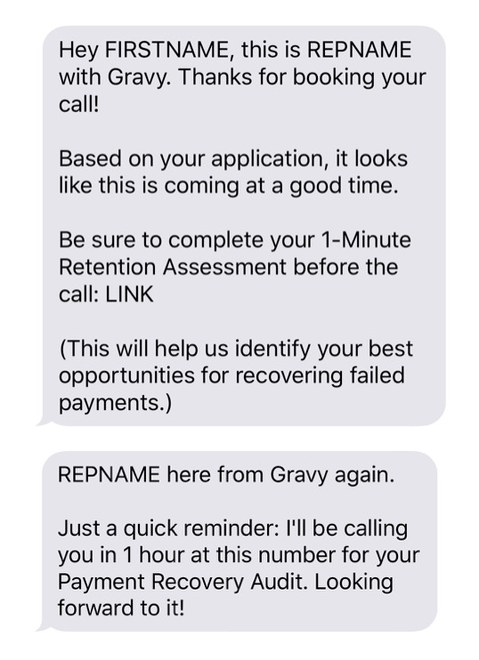
Simple, but effective.
After the Show-Up Sequence, the only thing left to do is script out a sales call that will convert prospects into customers! Which is exactly what the next section will show you how to do.
Funnel Stage #5: The Call

So, if Gravy were to implement all of our recommended changes to this funnel, what would the actual call need to look like?
How would they deliver on the call’s promise to deliver actionable strategies and recommendations while also incorporating a pitch for the prospect to hire them?
At a high level, you need to do 5 things on this type of sales call:
- Go over results from the prospect’s pre-call assessment
- Ask qualifying questions that raise problems the product solves
- Give the prospect valuable strategies for solving their biggest problems
- Explain how the product allows them to easily implement those strategies
- Close with offer
I haven’t done a sales call with Gravy, so I can’t compare their existing call structure/script to our criteria. BUT…I did go ahead and script out a detailed outline for how I would execute the call based on the structure we’ve refined on our own calls over the past 30+ months.
Go here to get a copy of the script so you can apply the same structure to your own sales calls.
If Gravy Followed These Recommendations…What Kind of Results Could They Expect?
Based on the results we’ve seen this funnel generate for multiple businesses, we ran the numbers for Gravy based on a price of $1,800/month and a couple of different scenarios to give you an idea of potential ROI.
Scenario #1: Moderate Ad Spend
What would happen if Gravy put $10,000 per month into Facebook ads for this campaign?
Based on what we’ve seen, it wouldn’t be unrealistic to think their cost per booked call would be around $150. Assuming a decent close rate of 20% on those calls, that would add up to:
- 66 calls per month
- 13 sales per month
- $23,400 in Month 1 (2.3x ROI)
- $280,800 from those first 13 sales in Year 1 (28x ROI)
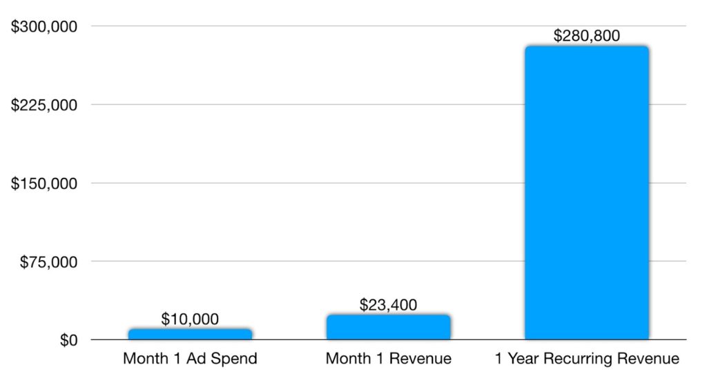
If those average numbers held for a year, they could bring in $3,369,600 of 12 months compounding revenue in Year 1.
Scenario #2: High Ad Spend
Let’s say Gravy went up to $25,000 a month in ad spend. Assuming their cost per booked call increases from $150 in the previous scenario to around $175, and their close rate drops from 20% to 15%, that would add up to:
- 142 calls per month
- 21 sales per month
- $37,800 in Month 1 (1.5x ROI)
- $453,600 from those first 21 sales in Year 1 (17x ROI)
Here’s what those numbers look like compared to the Scenario #1 numbers:
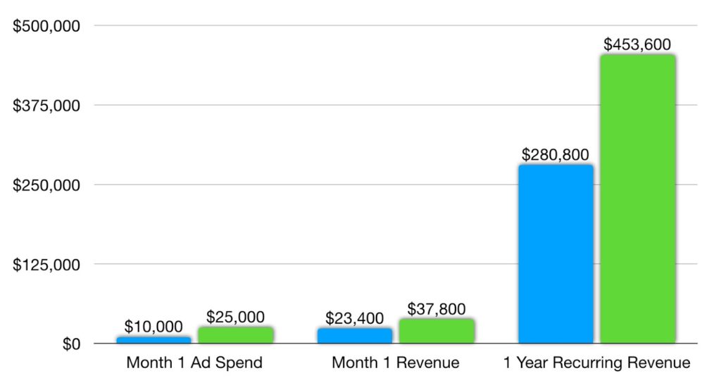
If those average numbers held for a year, they could bring in $5,443,200 of 12 months compounding revenue in Year 1.
What Would This Funnel Look Like for Other Types of Businesses?
What if your business isn’t like Gravy’s? What type of product or service would you need to have in order to borrow this same high-ticket sales funnel for your own business?
A productized service like Storytape:
If you’re a freelancer or agency offering productized services, one client can easily be worth thousands of dollars per year.
Storytape, for example, sells a done-for-you social media service to churches that costs $2,388 per year.
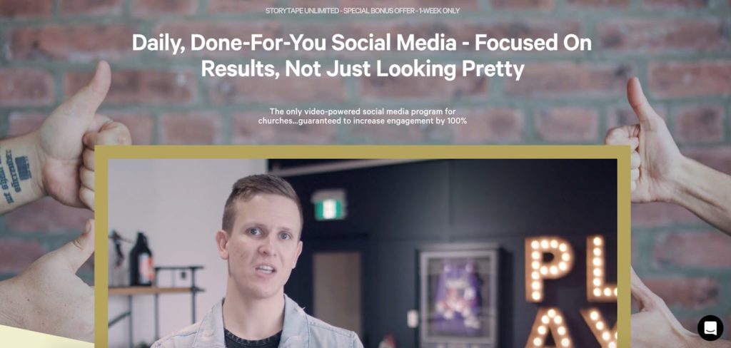
It’s easy to imagine them creating a lead magnet based around proven social media templates for busy churches that don’t have the budget for a full-time social team.
The thank you page could then offer a free social strategy audit phone call during which Storytape presents an offer for their done-for-you service.
A subscription software company like Ahrefs:
Many SaaS products have high-priced plans designed specifically for larger customers like enterprise companies or agencies.
The SEO research tool Ahrefs, for example, has plans that are worth thousands of dollars in revenue per year to the company. Check out these monthly prices for their Advanced and Agency plans:

Even if a customer pays gets 2 months free by paying annually, a single payment is still worth $3,390 and $9,990, respectively (not counting renewals).
Develop a lead magnet + free phone consultation designed to showcase how Ahrefs can solve some of their biggest problems and they’d be well on their way to generating high-ticket buyers on demand.
An ecommerce company like Michael Hyatt’s Full Focus Planner:
Even if your ecommerce company doesn’t sell high-ticket individual products, there’s a good chance you could create a bulk offering specifically targeting large customers like corporations.
Michael Hyatt’s Full Focus Planner, for example, has a bulk rate for orders of 200 or more planners that would be worth a minimum of $4,398 in revenue:
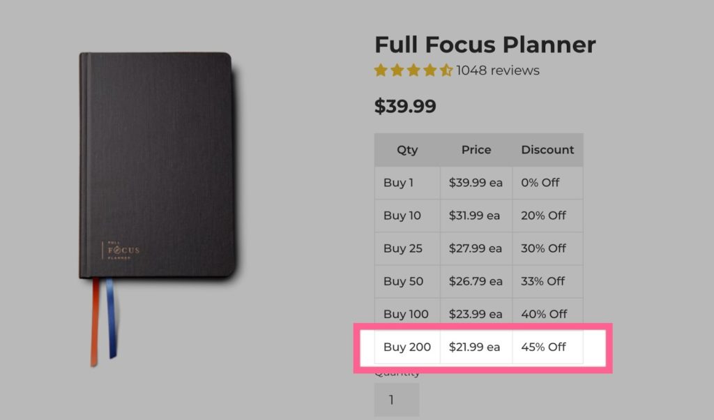
They could even incorporate a bulk planner offering into a package featuring leadership training, online workshops, or other high-end training/coaching services in order to increase the value of each sale.
Get Every Script, Template, and Resource from This Post So You Can Use Them to Build Your Own High-Ticket Sales Funnel
Our goal for this post is that you use it to create all the assets you need for your own funnel.
To make that easier, we’ve packaged up every resource we created for Gravy into one convenient folder so you can easily access it anytime you need it.
 Get it Free Featured Download: Get our entire high-ticket sales funnel. Including email sequence templates, landing pages and sales call script.
But first, leave a comment below and let me know—what type of high-ticket offering could your business sell? And what kind of impact could an effective funnel for that offering have on your revenue?
Want us to find the best 2-3 growth opportunities for your business?
Book a free Strategy Call with our team. We’ll look under the hood of your business, identify your best growth opportunities, and show you the action plan for taking advantage of them.
