A few months ago I put a little bar at top of every page on my website.
It looked like this…

The technical name for this bar is a universal call to action. Which is really just a fancy way of saying “something that everyone on your website sees no matter what page they are on.”
It works like this: You write a sexy little headline, give out something of value and you get leads in return.
Only problem was, when I looked at the numbers, I noticed that it wasn’t all that effective.
Here are the numbers:
2,500 people saw the bar
45 people clicked the bar
Total conversion rate = 1.8%
So for every 10,000 people who came to my website, only 180 became subscribers.
For those not familiar with what’s typical, 1.8% sucks.
Then one day I was on my buddy Brennan Dunn’s website and saw this:

It’s a universal call to action, but it looks amazing!
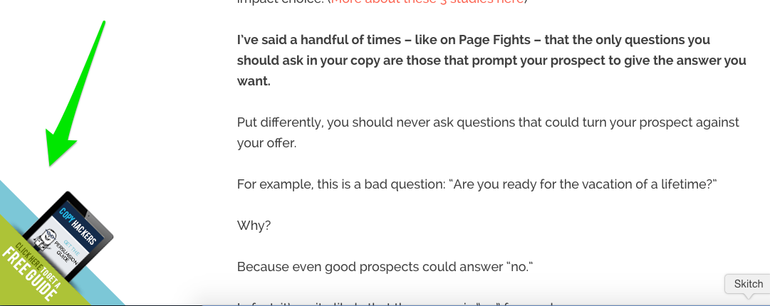
And then a few days later I went the Copyhackers blog and saw this:

Again, really unique call to action.
Both of these caught my eye.
They were different. They had oblong shapes, 3D edges and honestly… just looked better than anything I had seen in the past.
My hunch was that they were converting wayyyyy better than my little bar at the top of my website.
So, recently when I redesigned this site, I knew I needed something that actually worked.
Something that both stuck out to my readers and something that presented relevant offers to them based on their previous behaviors.
Enter Plinko.
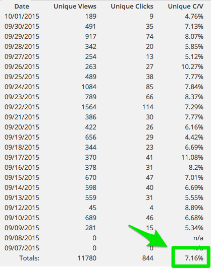
Plinko is a new tool that me and the team at 10ksubs recently built that increased the conversion rate from 1.8% to 7%.
This means that for every 10,000 visitors to the site, 700 people will join our email list (instead of 180 from the plain old bar).
These are our actual conversion numbers:

How does Plinko work?
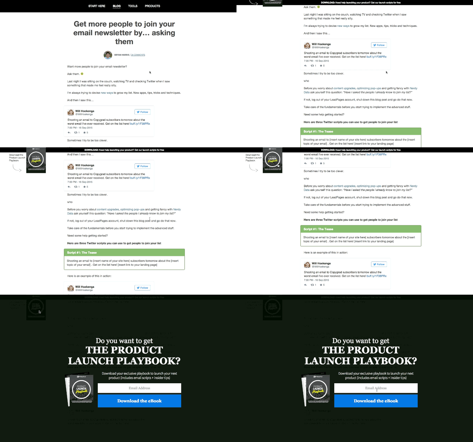
Check it out…

First, the bar doesn’t always show on the page. It only appears (with a nifty little eye-catching animation) once the reader scrolls down into the blog post.
Second, instead of just having a bar at the top of the screen, Plinko shows the reader a picture of the thing they are going to get.
In this case, it’s a picture of the email scripts that I’m giving away.
Last, when the reader clicks the bar (or the picture of the email scripts), they don’t have to wait for the page to reload. They immediately get an overlay on the screen with instructions on how to get the email scripts I teased in the bar.
Good-bye landing pages!
No reloading.
No boring bars.
And way more subscribers. (520 more.)
YAY!!!
But wait! There’s more!
The fun thing about creating software is that when you see a huge need going unmet, you can go build something to fill that need.
One thing that annoys the crap out of me about 99% of all websites is how dumb they are.
For example…
Let’s say you offer an e-book to download in your sidebar.
What happens after I opt in to that e-book? You keep asking me to download the SAME STUPID E-BOOK!
GAR! So annoying!
That’s prime real estate on your site being wasted with an offer that’s no longer relevant to me.
Instead of showing the same free e-book or video course over and over ,what if you could walk your readers through your sales funnel?
My funnel might look something like this.
Step 1: Offer my product launch email scripts.
Step 2: Offer install of List Goal.
Step 3: Offer $10 product.
Step 4: Offer $200 product.
Right now, you can’t do that. No software exists that’s smart enough to know if your reader has opted into what you are offering so that you can offer the next thing in the funnel.
Which means people see the sammmmmeee stuff over and over and they become numb to it.
So, we’re going to build it. Woot!
In fact, just yesterday I sent the first public phase of Plinko to the developer to start working on.
Here is the video I sent (f you’re interested in behind the scenes of how I develop software, this video will be super interesting):
How can you get a copy of Plinko?
As we built out the first version of Plinko I live tweeted about it (here and here). I mainly did that to chronicle the process, see what people thought and get some real time feedback.
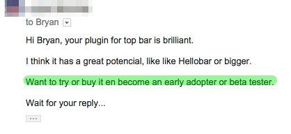
But after talking about it publicly I started getting emails like this…

But here is the problem with selling Plinko, if all 28,000 of my subscribers go install this tomorrow (which would be incredible) then it won’t be as effective.
The same banner blindness that causes the plain old bar not to work well will cause Plinko to become less affective once 10’s of thousands of people start using it.
In short: the fewer people who use it, the better results its users will get.
So I had an idea!
In a few weeks, my premium course Get 10,000 Subscribers will open for fall enrollment.
What if I give a free copy of Plinko to all the students of the course?
That would be fun! Keep it exclusive and provide a big enough beta user base to continue building the app and improving it.
After having this idea, I held a quick board meeting (with myself) and was like…

Plinko + 10ksubs = !!!!
So, if you’d like a beta copy of the app, do two things:
Thing #1: Go get on the 10ksubs waiting list.
Thing #2: Enroll in the course when it comes out in a few weeks.
If you are already enrolled, perfect! You’ll get a beta copy of Plinko as well! YAY!
PS: Got any cool feature ideas for what we could do with Plinko? Leave them in the comment section below.