I grew up in the deep South. My parents were religious and as a result, so was I. We went to church every Sunday.
Once a year there was this traveling preacher who would come to our town and preach a series of lessons for a solid week
Normally, this would be torture to any 8 year old boy. A boy that age would much rather play in the mud and build forts instead of sitting in a pew.
But with this one traveling preacher, it was different. I looked forward to him coming.
Why?
He told incredible stories. He didn’t preach, he just talked like a normal person. He told stories like we were sitting around the living room.
It was natural.
I always wondered how he came up with all of these stories. It was fascinating to me. They were all riveting and fresh. Finally, one day I asked him.
He told me,
“I keep a file. Everytime I hear a story that grabs me, I put it in that file. Then anytime I need a story I go back to that file”
Years later I discovered that these files had a name. They are called swipe files.
And they can be used for anything, not just old preacher stories.
They make creating anything substantially easier.
For example:
This past weekend I started updating the main landing page for this site. Luck for me, I keep a folder with every well designed landing page I come across.
That made my job easy. I found 3 pages I liked and use them as inspiration.
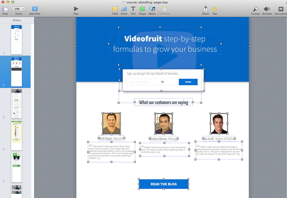
An hour later and one well manicured Keynote file later, I had this mockup:

Then I exported it out of Keynote as a PNG and sent it off to a coder. Now it’s live!
Without a swipe file, It would have taken me days or even weeks to create the design it from scratch.
The Breakdown:
This landing page is a conglomeration of 3 other landing pages I’ve documented over the last 6 months.
Inspiration 1: Mixergy.com
I used Andrews overall page layout. Large text up top and an optin form in the middle.

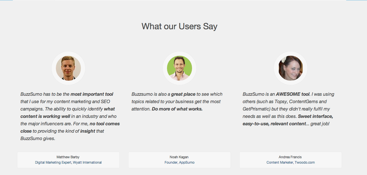
Inspiration 2: Buzsumo.com
I used their 3 column testimonial layout.

Inspiration 3: okdork.com
I used Noahs testimonial formatting and “read the blog” button.

The Tool that makes it easy
When I first started trying to document these pages I ran into a problem. My normal screen capture software would not take a snapshot of an entire web page. It would just capture what was visible at that moment.
The problem is most pages are longer than what you can see in your browser at any one moment. After testing every screen capture program I could find I have finally found one that does the trick.
It is called https://web-caputre.net.
And it’s free.
Here is it in action: (sorry for the crappy audio)
I keep a link to web-caputre.net in the toolbar of my browser so it’s easy to find anytime I need it.
If you want to start your own swipe file, I’d recommend doing the same.
FREE bonus for you
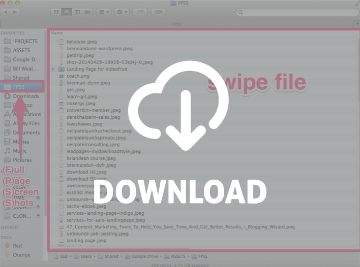
I’ve made my entire landing page swipe file available to you. Use it, copy it, do whatever.
It’s been a great asset to me.
Enter your email address here and I’ll send you a link to it.
